The Alcheringa app, rebuilt as an 8‑bit game you play by showing up
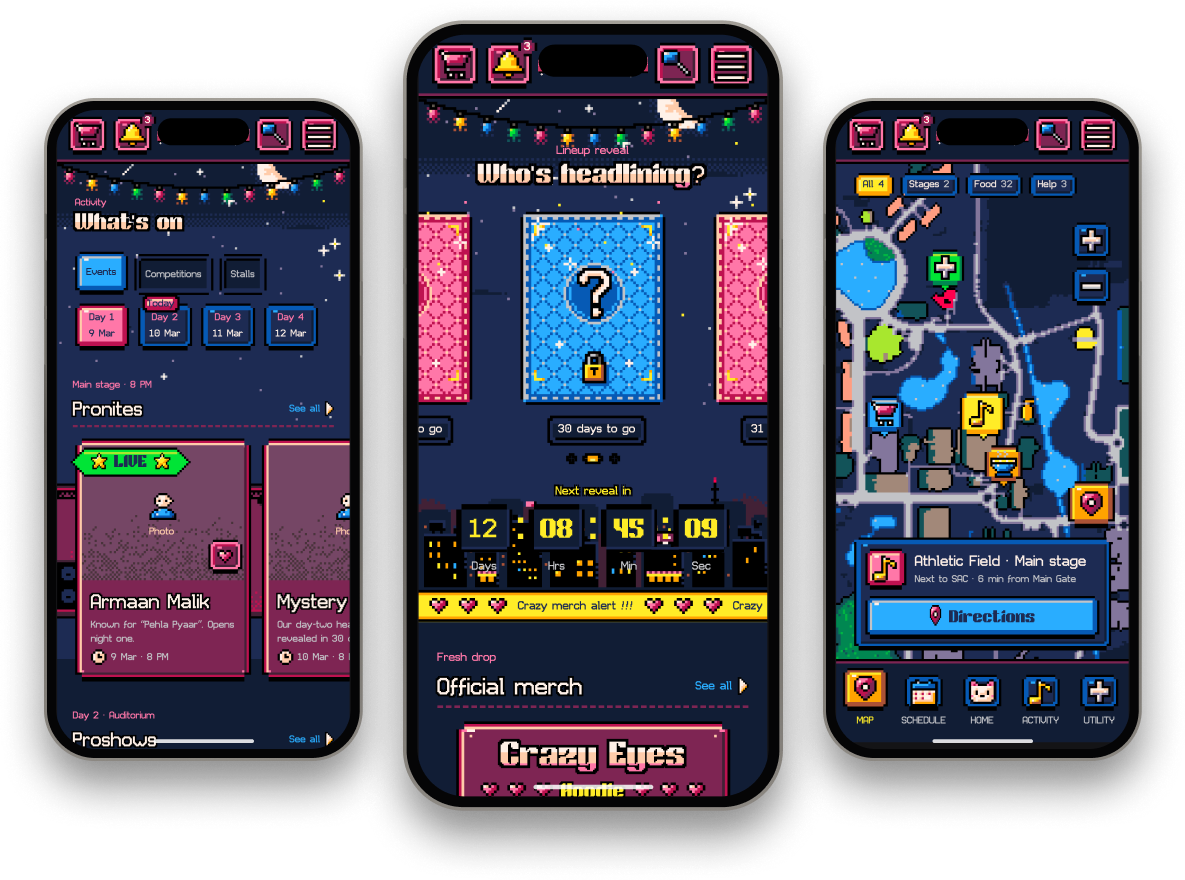
The official app of IIT Guwahati’s cultural festival. The ’24 revamp made events findable; ’25 keeps all of it and wraps it in a pixel-art world where showing up earns XP.
ACT 01
GATES OPEN
The festival, the app, and why it needed a fifth rebuild.
- Role
- Product designer, the only designer on the Alcheringa ’25 team
- Timeline
- Android and iOS · live 20 days before Day 1
- Overview
- Every year a new student team rebuilds the Alcheringa app. ’24 fixed finding things. In ’25 I kept all of it and gave the app a game’s logic and an 8-bit skin, so showing up became playing.
SCOPE
- Attendee app: schedule, venues, artists, passes and merch
- Every screen redesigned in an 8-bit system, plus gamification on top: a progression system (XP and levels), achievements and a fest-wide leaderboard
- Out of scope: organiser tools, the ticketing backend and the website.
CONSTRAINTS
- Hard deadline: live on the stores before Day 1
- One designer and a student dev team, shipping to Android and iOS
- ’24’s structure, backend and data carried over; the new UI had to fit them
PROCESS
- Audit the ’22–’24 apps
- Re-read the ’24 team’s research and the store reviews
- Concept: the fest as a game, checked with the dev team
- 8-bit system, iterations with mentors, handoff
WHY REDESIGN
’24 reached 2.5K+ downloads, about 50% more than ’23. The number it had no way to move was how often people came back: nothing in the app changed after you went to an event. That became the ’25 brief.
Here’s the festival it had to run.
Context
A four-day festival, rebuilt as an app every year by a new team.
The festival
- Day 0 to Day 3: an inauguration and a classical night, then three days of 80+ events and competitions across the IIT Guwahati campus
- 10,000+ footfall: campus residents, the city, and teams from 500+ colleges
- A pronite every night — Blitzkrieg, Juggernaut, Crescendo — and competitions all day
Why an app
- Schedules shift by the hour; posters and Instagram can’t keep up
- Venues are spread across a large campus most visitors don’t know
- Passes, merch and entry all run through the same four days
The brief for ’25
- 01 Keep: everything ’24 shipped — search, schedule, map, passes, merch
- 02 Fix: late alerts, and a campus nobody can picture
- 03 Add: a reason to open it between events
- 04 Ship before Day 1, in the ’25 theme
FOUR EDITIONS, FOUR TEAMS
Each one kept the template and fixed the thing the last one couldn’t.
’22
ShippedSet the template
Schedule, pronites and passes in one app. The shape every edition since has kept.
’23
ShippedThe information existed
Uncategorised and hard to find: no search, nothing on stalls or transport. The baseline ’24 audited.
’24
ShippedMade events findable
Search and filters, categorised explore, liked events with reminders, directions in every sheet, merch checkout. 2.5K+ downloads.
’25
Gave people a reason to come back
Every ’24 feature, in an 8-bit system with XP, levels, achievements and a leaderboard on top.
KEPT FROM ’24
- Search and filters
- Liked events with reminders
- Directions in every event sheet
- Merch checkout
- Passes
ADDED IN ’25
- 8-bit system
- XP for showing up
- Levels
- 12 achievements
- Fest-wide leaderboard
- Lineup reveal
- Front-row passes
Source: my audit of the ’22–’24 apps, and the ’24 Play Store listing.
Here’s what the ’24 app got wrong.
ACT 02
THE CROWD
Who comes, what they said, and what the ’24 team already knew.
The problem
’24 fixed finding things: search, filters, liked events, directions. People still opened the app only when they needed something, then closed it.
ATTENDEES DESCRIBE THE SAME PROBLEM IN THEIR OWN WORDS
I was so confused about what event to attend.
Finding wasn’t the problem.
Choosing was.
‘Mini Auditorium’ means nothing to an outsider.
Directions existed in every event sheet. A route to a name you can’t picture isn’t orientation, so volunteers still did the wayfinding.
’24 team interviews
People screenshot the schedule, then close the app.
Liked events and reminders were the right mechanic with no visible payoff, so the app lost to a screenshot.
’24 team interviews
Nothing changes after you attend something.
The only ‘mine’ things were liked events and merch orders. The ’24 brainstorm had engagement ideas and parked them for feasibility.
’24 app reviews and the ’24 brainstorm
Findings reused from the ’24 team’s research, credited where used.
Two attendees showed this most clearly.
The attendees
Two attendees, one need: get through four days without missing the thing they came for.
Who I designed for
The ’24 team’s personas and interviews, re-read and extended rather than redone. Split by why they come: to compete, like Ananya, or to explore, like Riya.
P1 · COMPETES
Ananya Sen
Persona A · The outstation participant
- 21 years old
- Delhi, India
- Captain of her college dance team
“We came for Electric Heels. I don’t care about the lineup if I can’t find the stage.”
- Outstation
- Competing
- First time on campus
- Travels in a team
Design implication
Needs the venue and the clock before anything else.
Activity split by day with the venue on every card, and walking directions in the Map tab.
Goals
- Reach her team’s competition venue on time, every round, on a campus she has never seen.
- Catch at least one pronite without missing a call time.
Pain Points
- The venue names mean nothing to her. ’24’s directions get her there; the campus still never makes sense.
- A round gets delayed. ’24 sends the alert; nothing helps her re-plan the hour she just got back.
P2 · EXPLORES
Riya Das
Persona B · The campus explorer
- 20 years old
- Guwahati, Assam
- Second-year B.Des, IIT Guwahati
“I’m excited about everything and I have no idea what to go to first.”
- Lives on campus
- Here for the nights
- In a group
- Phone-first
- Buys merch
- Explores everything
Design implication
Needs a reason to open the app between events.
A Home that gives her something to do before Day 1, and XP for showing up once it starts.
Goals
- Explore everything, with friends, and come out with something to show for it.
- Know where to start: eighty events is a list, not a plan.
Pain Points
- Overwhelmed by the number of events; ’24’s categories and search helped her find, not choose.
- The app never noticed she’d been anywhere, so she stopped opening it.
Their story was already in the ’24 team’s research.
Research
Attendees don’t want more information. They want the next hour, the way there, and a reason to come back.
Where it came from
Attendees don’t change much between editions, so I didn’t redo the interviews. I re-read the ’24 team’s interviews and SWOT, read the Play Store reviews of the ’24 app, and audited the ’22, ’23 and ’24 apps alongside other fest apps myself. Where a finding is the ’24 team’s, it says so.
Previous apps
What each edition did well, and what attendees still lacked.
HOW THE OTHER FESTS HANDLE IT
| App | What it does well | What ’25 changes |
|---|---|---|
| Alcheringa ’24 | A full revamp: search and filters, categorised explore, liked events with reminders, guest mode, a schedule grid by venue, directions in every event sheet, merch checkout. 2.5K+ downloads. | Keeps all of it. Changes how it looks, and why you’d open it a second time. |
| Alcheringa ’23 | The information existed but was uncategorised and hard to find; no search, nothing on stalls or transport. | Two editions later, findability is solved. ’25 spends its effort on engagement instead. |
| Alcheringa ’22 | Set the template: schedule, pronites and passes in one app. | ’25 keeps the template, so the structure attendees already know stays. |
| Mood Indigo, Antaragni, Ziro | ’24’s SWOT: instinctive navigation and categorised information, but forced sign-in, no delay alerts, information scattered across platforms. | Still utilities. None make the fest itself feel like play; that gap is the ’25 bet. |
None
of the previous editions gave attendees a reason to open the app between events.
Reviews and audit
Same template
Home, Activity, Schedule, Map and a toolbox; an event sheet; passes and merch. ’24 set the shape, attendees know it, ’25 keeps it.
Audit of ’22–’24
Parked in ’24
’24’s brainstorm had the engagement ideas (personal highlights, coupons, prop scanning, winners’ lists) and parked them for feasibility. ’25 picks up the thread.
’24 brainstorm
Insights
Three insights, and one gamification system that answers all of them.
Clustered findings
I clustered the ’24 team’s findings and the ’24 reviews by what they would change. Three clusters held almost everything.
INTERVIEW FINDINGS
Too much, no path4 findings
- First-timers are overwhelmed by the number of events
- “I was so confused about what event to attend”
- Search and categories help you find, not choose
- Pronites are the one thing everyone plans around
Where, from here5 findings
- “Mini Auditorium” means nothing to an outsider
- Directions exist; a sense of the campus doesn’t
- Volunteers still do the wayfinding
- Delays move people between venues at short notice
- Groups split up and can’t regroup
A reason to come back4 findings
- Nothing changes after you attend something
- Liked events and merch are the only ‘mine’ things
- People screenshot the schedule, then close the app
- ’24 parked its engagement ideas for feasibility
Each cluster became a change. Gamification tied them together.
ACT 03
SOUNDCHECK
One rule, one idea cut, and the structure underneath.
What changed and why
The fest as a game: showing up is the score.
The idea
A festival already has levels (days), checkpoints (events), a map and loot (merch). The app only had to admit it. 8-bit was the honest skin for that: cheap to build, instantly readable as play.
The design challenge
How might the app make four days of a festival feel like a game worth playing, without ever getting in the way of the schedule?
The team’s MoSCoW board set one rule. The first idea broke it.
The board
Must have
A gamified app, with gameplay an immersive part of the experience.
Should have
Fun gameplay and gamified UI interaction, but up to the user’s choice.
Could have
A progression system: points for playing, tied in with the physical event.
Won’t have
Gameplay elements interfering with the UI or normal functionality.
The rule it produced
Play sits on top of the utility, never in its way.
XP, levels and the leaderboard are optional. Ignore all of them and you still get to your event.
Idea 1
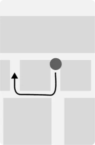
Every UI element is a game object: press one and a character shoots it. A ‘game mode’ toggle turns the whole interface into a top-down RPG or platformer map.

App mode
Game mode
Cut.
A second mode that takes over the interface is exactly the Won’t-have. What survived is the Could-have: XP for showing up, on top of the utility.
Source: the ’25 team’s concept board. MoSCoW and Idea 1 are quoted from it, lightly condensed.
What changed in ’25
Three changes, one rule. The 8-bit system carries all of them.
The rule
Play never costs a tap. XP, levels and the leaderboard sit on top of the utility: ignore all of them and you still get to your event.
01 Activity by day, not a list
Events, competitions and stalls split by day, today selected, the night’s pronite on top. Saving one puts it in Your day with a reminder 30 minutes before. The job is choosing now, not finding.
DrivesToo much, no path
02 A map you can read, directions you can follow
Stages, food and help as filters on one campus map, a card for the nearest landmark (‘next to SAC · 6 min from Main Gate’), and walking directions in three lines. Every venue name comes with a place.
DrivesWhere, from here
03 XP for showing up
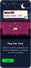
Check in at an event, rate a stall, be first to a lineup reveal: each earns XP. XP levels you up, unlocks achievements, and ranks you, your team and your hostel. Top players win front-row passes.
DrivesA reason to come back
With the changes set, I had to make them fit the structure attendees already knew.
Shaping the app
Same structure as ’24 underneath, so nobody had to relearn the app.
Information architecture
Five tabs with Home in the middle: Map, Schedule, Home, Activity and Utility. A sidebar holds passes, orders, the leaderboard, sponsors and settings. Gamification lives inside these sections (XP on Home and Profile, the leaderboard under Utility and Competitions), never as a tab of its own.
- 0.0Onboarding
- 0.1Loading
- 0.2Welcome
- 0.3Meet Pixel
- 0.4Earn XP
- 0.5Notifications
- 0.6Skip → Log in
- 1.0Sign up / Log in
- 7.0Profile
- 8.0Merch & cart
- 9.0Passes
- 10.0Settings
- 1.1Profile setup
- 2.0Home
- 2.1Lineup reveal
- 2.2Merch drop
- 2.3Alcher pass
- 2.4Picked for you
- 2.5Search
- 2.5.1Filters
- 2.6Notifications
- 3.0Activity
- 3.1Events
- 3.1.1Artist detail
- 3.1.2Event detail
- 3.1.3Add to day
- 3.2Competitions
- 3.2.1Register team
- 3.2.2Success
- 3.2.3Leaderboard
- 3.3Stalls
- 3.4Rate stall
- 3.1Events
- 4.0Schedule
- 4.1Your day
- 4.2Reminders
- 5.0Map
- 5.1Campus map
- 5.2Directions
- 5.2.1Location access
- 5.2.2Walking route
- 6.0Utility
- 6.1Passes
- 6.2Orders
- 6.3Leaderboard
- 6.4Sponsors
- 6.5Help
Low-fidelity wireframes
I wireframed the core screens before any pixel art, to make sure the utility worked at grey-box level. Gamification went only where a screen had already earned its place.
Two Homes at grey-box: map-first and card-first. Card-first won; the map became a tab.
A: Map-first Home
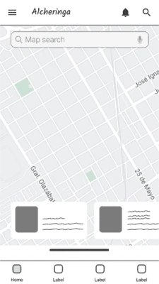
The campus map is the Home and events are pins. Good on fest day, empty the week before: nothing to come back to.
B: Card-first Home
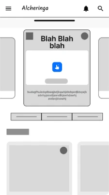
A stack of cards: lineup reveal, your pass, merch. Something new each day, and the map still one tap away.
C: Card-first, main card open
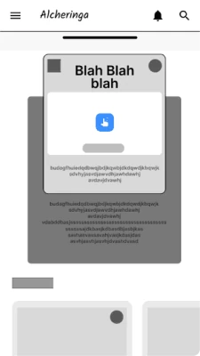
The main card expands in place, so the day’s headline act and your next event are the first things you read.
Three of the grey-box screens. B shipped; A became the Map tab.
Then the pixels went on.
ACT 04
PRONITE
Five moments of the fest, inside the app.
The experience
Five moments, not five features: before the fest, the day, the way there, the night, and what you keep.
How to read this
Each step is one moment in an attendee’s fest, the screens that serve it, and the decision behind them.
THE WHOLE MAP
Step 1 of 5
Have a reason to open it before Day 1
Start the game before the fest.


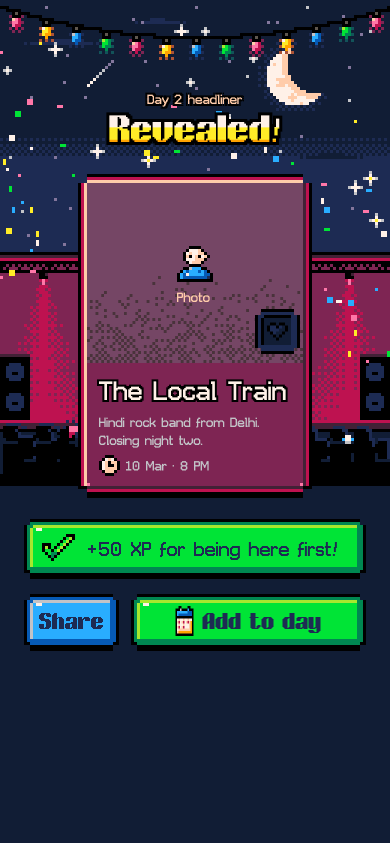
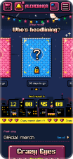
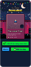
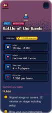
- Lineup reveal on a countdownOne mystery card per headliner, unlocked when the timer hits zero. Home has a reason to be opened a month before Day 1.
- Being there first earns XPThe reveal screen pays 50 XP to whoever opens it first. The pass, claimed from the same Home, puts that XP on the leaderboard.
- Merch drops land on HomeReal product photos inside pixel chrome. A drop is one more reason to come back before the fest starts.
“I'm excited about everything and I have no idea what to go to first.” — Riya
Design decision
Start the game before the fest
- Insight
- '24's Home led with the headline act and explore chips: complete, and the same every day. Nobody opened it until the schedule was out, and the '24 research found first-timers overwhelmed when they finally did.
- Decision
- Home opens a month out. The lineup is revealed one mystery card at a time on a countdown, being there for a reveal earns XP, and claiming your pass puts you on the leaderboard. Merch drops land here too. By Day 1 the app is already a habit.
- Tradeoff
- A pre-fest Home depends on the organisers feeding it reveals on schedule. If a reveal slips, the countdown lies, so the card falls back to 'revealing soon' with no date rather than a wrong one.
Step 2 of 5
Choose the day, then the event
Split by day, pronites first.
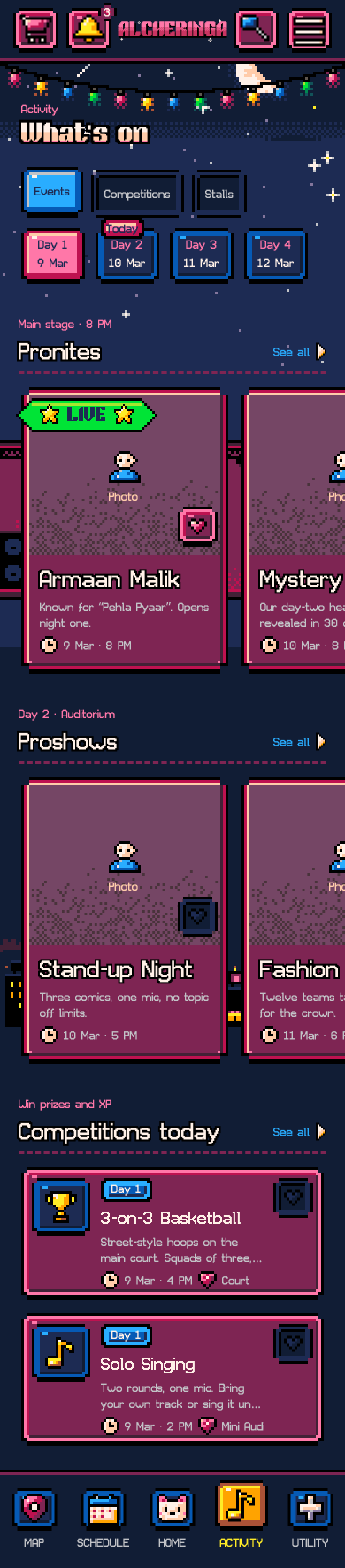
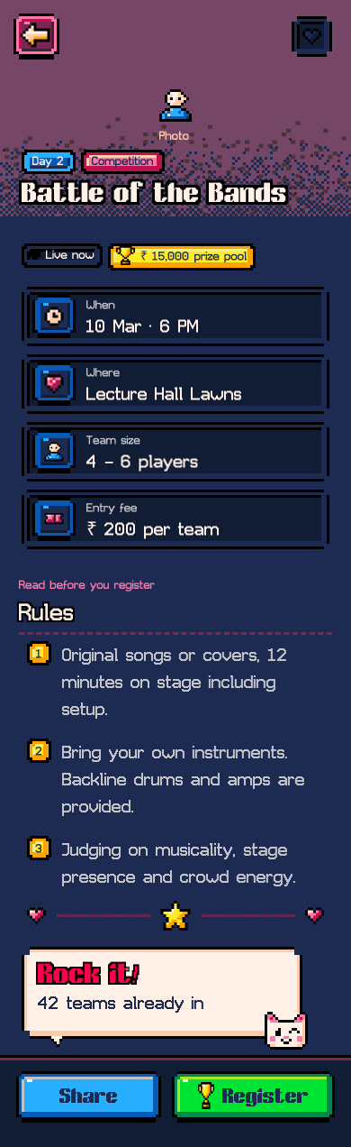
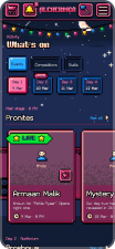
- Day tabs, today selectedFour days, one tap each. The list is today's; tomorrow is a tab, not a scroll.
- Pronite on top, live firstTonight's headliner leads the day and a LIVE tag marks what is on right now, so choosing starts from the thing everyone plans around.
- Register from the sheetWhen, where, team size, fee and rules on one sheet. Register puts it in Your day with a reminder 30 minutes before.
“Eighty events is a list, not a plan.” — Riya
Design decision
Split by day, pronites first
- Insight
- '24's categorised explore and search let people find anything, and its research found first-timers overwhelmed anyway. Finding wasn't the problem; choosing was.
- Decision
- Activity is one tab with three rails (Events, Competitions, Stalls) split by day, today selected, the night's pronite on top. An event sheet shows when, where, team size and rules; saving it or registering puts it in Your day with a reminder 30 minutes before.
- Tradeoff
- Day tabs hide tomorrow. For someone planning a whole trip, Day 2 is a tap away rather than on screen, which is the price of a short list for today.
Step 3 of 5
Get to the venue
A name needs a place.
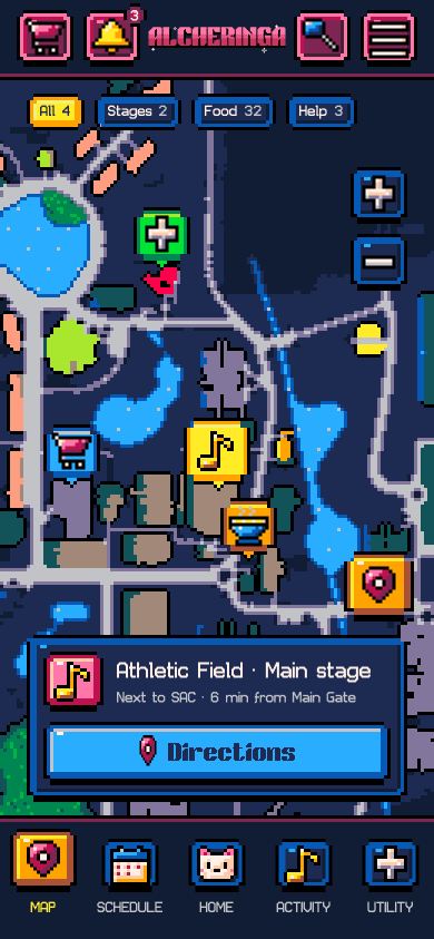
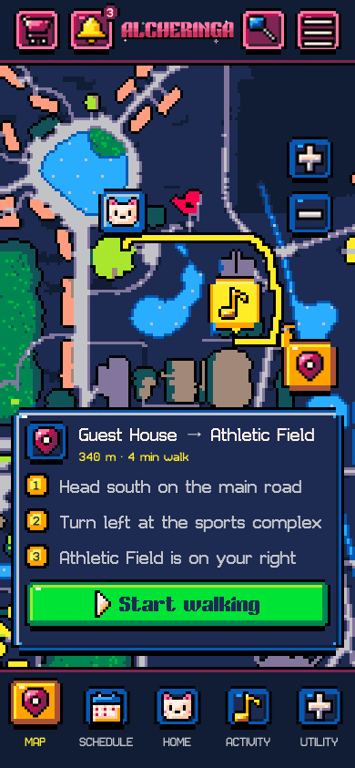
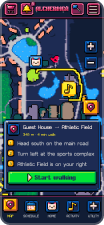
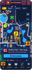
- Filters, not a legendStages, food and help as chips on one campus map. Thirty-two stalls collapse to a single tap.
- A card with a landmark“Athletic Field · next to SAC · 6 min from Main Gate.” The name comes with a place you can picture and a time you can plan around.
- Three lines to walkHead south, turn left at the sports complex, it is on your right. Directions you can remember with the phone in your pocket.
“I don't care about the line-up if I can't find the stage.” — Ananya
Design decision
A name needs a place
- Insight
- '24 put directions in every event sheet, and outsiders still asked volunteers. A route to a name you can't picture isn't orientation.
- Decision
- The Map tab filters the campus into stages, food and help, and every venue card carries a landmark and a walk time: 'next to SAC · 6 min from Main Gate'. Directions are three plain lines, not a turn-by-turn feed.
- Tradeoff
- The map is its own tab, so getting from an event sheet to its venue takes two taps. 'Find on map' exists on stalls; putting it on every event is the first thing I'd add.
Step 4 of 5
The night: pass, gate, level up
Plain where it has to scan.
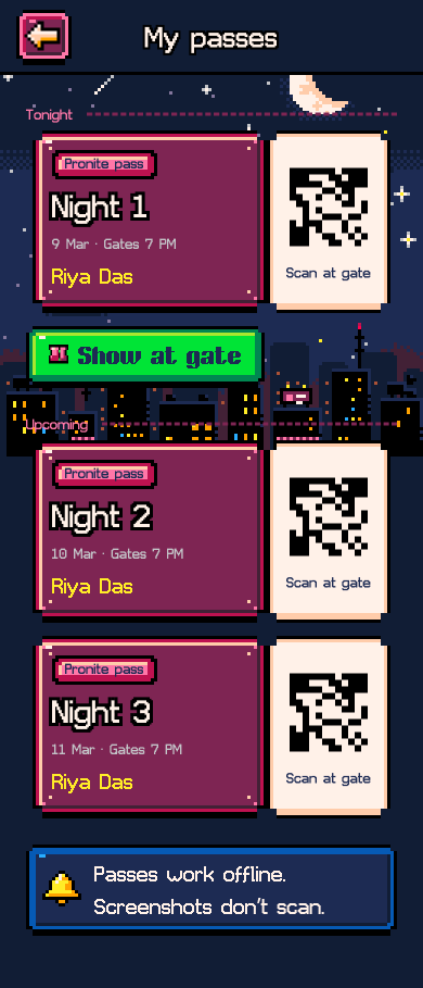

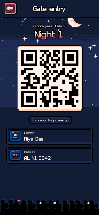
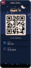
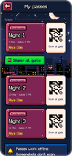
- Tonight's pass firstMy passes leads with tonight and keeps the other nights below. It works offline, because the gate is where the signal dies.
- The QR drops the skinGate entry is black on white at full brightness with the pass ID underneath. The one screen that must scan gets no pixel treatment.
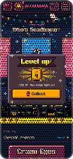
- Getting in levels you upA scanned pass is a check-in: XP lands, the night's badge unlocks, and the leaderboard moves. Showing up is the score.
“One pronite, no missed call times.” — Ananya
Design decision
Plain where it has to scan
- Insight
- Pronites are why most people come. In '24 the pass lived in a screenshot, and the gate was the slowest minute of the night.
- Decision
- Each night gets its own artist screen with gates and timings. My passes shows tonight's first and works offline; gate entry drops the 8-bit treatment entirely: black QR on white, brightness up. Getting in levels you up and unlocks the night's badge.
- Tradeoff
- Passes are personal and screenshots don't scan, which stops sharing but means a dead phone is a dead pass. The fallback is the pass ID printed under the QR, which the gate can look up.
Step 5 of 5
What you keep
Showing up is the score.
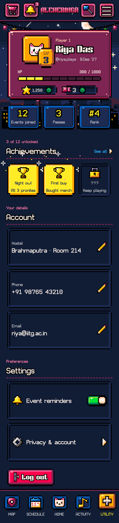
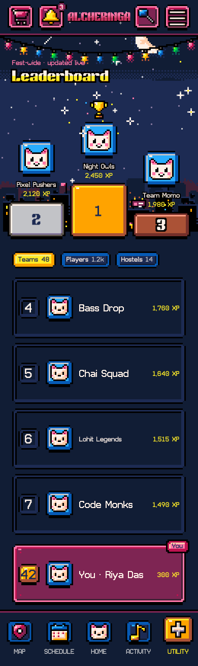
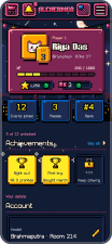
- A player card, not a settings pageLevel, XP, events joined and rank sit above the account details. What you did at the fest comes before who you are.
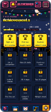
- Locked badges are named3 of 12 unlocked, and the other nine say what earns them: visit five stalls, rate ten, all four days. Something to aim at, not a grid of question marks.
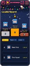
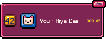
- Teams, players, hostelsThe leaderboard ranks all three fest-wide and keeps your own row pinned at the bottom, so rank 42 still has a next step.
“Come out with something to show for it.” — Riya
Design decision
Showing up is the score
- Insight
- In '24, your pass, your liked events and your merch orders sat in three places, and nothing in the app recorded that you had been anywhere.
- Decision
- Profile is a player card: level, XP, events joined, rank, and 3 of 12 achievements with the locked ones named so there's something to aim at. The leaderboard ranks teams, players and hostels fest-wide; the Utility toolbox holds passes, orders and everything else.
- Tradeoff
- Ratings earn XP, so they can be farmed. The terms say accounts that game check-ins or ratings get reset; a per-day cap is the next thing to design, because front-row passes as the prize make this worth policing.
Underneath the screens is a system built for pixels.
ACT 05
BACKSTAGE
The type, colour and kit that hold it together.
Brick Pixel for display, Game Tape for reading.
Brick Pixel · display
LEVEL UP
ABCDEFGHIJKLMNOPQRSTUVWXYZ
LVL 7 · 09 MAR · 2026
Titles, level numbers, XP counts, HUD labels. Caps only; it was never asked to carry a sentence.
Sizes in use: 37 · 29 · 22
Game Tape · body
Your day starts at 6 pm with the pronite.
ABCDEFGHIJKLMNOPQRSTUVWXYZ abcdefghijklmnopqrstuvwxyz 0123456789
Check in at an event, rate a stall, be first to a lineup reveal: each earns XP. XP levels you up, unlocks achievements and ranks you, your team and your hostel.
Body, buttons, cards, Pixel’s dialogue.
Sizes in use: 28 · 21 · 14
Where it stays plain
Money and entry are set in the body face at 21 or larger, never in Brick Pixel. Reading a price or a pass at a gate is not the moment for identity.
₹ 2,499
Pass · Row A · 6:00 pm
₹ 2,499
not this
Type scale read off the v3 screens. Both faces are loaded in the app; Hanken Grotesk is only this case study’s voice.
Colour
’24’s palette came from its theme, Chromatic Elysium. ’25’s is PICO-8: the 16-colour palette of a fantasy console, limited the way 8-bit hardware was limited. One colour marks what’s live, one marks what’s yours. Merch stays in photographs: nobody buys a hoodie from a sprite.
PICO-8 underneath, extended where the fest needed it: 27 tokens in one Arcade collection.
Backgrounds, ink and text
- bg/
night#1D2B53 - bg/
raised#7E2553 - bg/
sunken#111D35 + - bg/
grid#111D35 + - ink/
outline#000000 - text/
primary#FFF1E8 - text/
secondary#C2C3C7 - text/
muted#C2C3C7 - text/
on-light#1D2B53
Accent ramps
- magenta/
300#FF77A8 - magenta/
500#BE1250 + - magenta/
700#422136 +
- cyan/
300#29ADFF - cyan/
500#29ADFF - cyan/
700#065AB5 +
- lime/
300#A8E72E + - lime/
500#00E436 - lime/
700#008751
- yellow/
300#FFEC27 - yellow/
500#FFEC27 - yellow/
700#FFA300
- orange/
500#FFA300 - orange/
700#AB5236
- cream/
500#FFF1E8 - cream/
700#FFCCAA
- purple/
500#754665 + - purple/
700#49333B +
+ extended beyond the 16 PICO-8 colours: eight tokens, seven values. The rest are the console’s own.
Tokens read from the app file’s Arcade variable collection (Default mode). Four pairs share a value: bg/grid = bg/sunken, text/muted = text/secondary, cyan/300 = cyan/500, yellow/300 = yellow/500.
Components
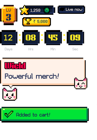
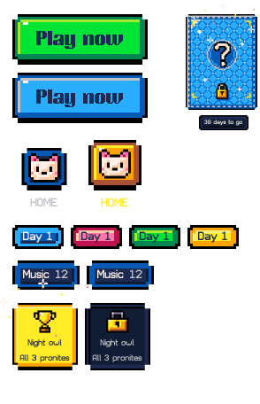
RPG dialogue boxes for Pixel the mascot, a HUD for XP, level and countdowns, title plates, ticket passes and a mystery card for reveals. Each component is drawn as one vector per colour, so it scales without blur, and the ones that carry money or entry (payment, QR, prices) stay plain.
One kit, one 8-bit grammar. Payment, QR and prices stay plain.
Cards
HUD and overlays
Controls and game
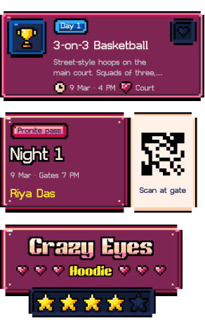
Event card · Ticket pass · Title plate
Level badge · Resource counter · Prize tag · Live · Countdown · Pixel’s speech bubble · Toast
Buttons · Nav items · Mystery card · Tags · Filter chips · Achievement tiles
Live instances of the v3 library. Each glyph is one vector per colour, so it scales without blur. 20 button variants, 3 mystery-card states, 4 tag tones.
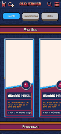
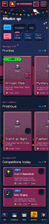
v1 went to the developers first. The detailing pass gave Activity its days and Map its filters and landmark card, without moving anything attendees had already learned.
v1 · Activity, dev-ready
v3 · Activity
v1 · Map, dev-ready
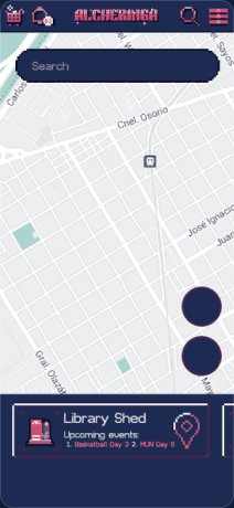
v3 · Map
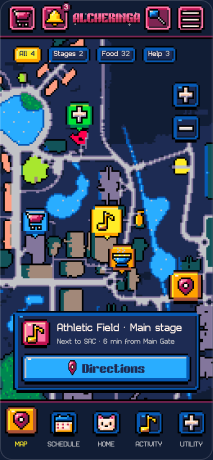
v1 is the build handed to the developers; v3 is the final. Both are '25 team work.
What’s left is what I’d do next.
ACT 06
AFTER THE FEST
What’s next, and what I’d keep.
Biggest risk
Novelty wears off
If XP and the leaderboard don’t change what people do by Day 2, the gamification is decoration. Day-2 open rate against ’24’s is the test.
Success metrics
Opens between events
Opens per attendee between events, check-ins per attendee, and the share of saved events actually reached. XP from ratings against XP from check-ins shows whether people are farming.
Usability test
The map, with outsiders
Test the pixel map with people who’ve never seen the campus, at night, in the real pronite crowd. Orientation, not aesthetics, is the question.
One thing I’d tell the ’26 team.
Reflection
Skinning a utility as a game is the easy part. Making the game serve the utility is the work.
What I learned
The 8-bit look got the attention; the schedule had to keep it. Every time gamification made a job slower, the job won, so the rule became: play never costs a tap. I’d carry that into anything with a theme on top of a tool.
Credits
Thanks for playing through to the end. The full research, the appendix and the handover notes for the ’26 team are one link away.